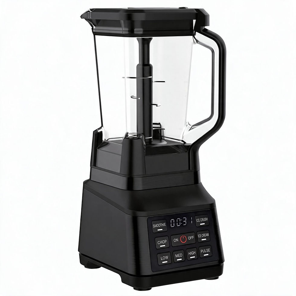
How to Review Colour and Gloss on Kitchen Appliance Samples

Updated: 1 day ago

“The colour needs work.”
It is a familiar type of sample comment, but it leaves several questions unanswered. Which part needs attention? What is it being compared with? Is the concern about hue, gloss, texture or the way two components look together?
For a brand reviewing a kitchen appliance, the intention may feel obvious. For the person arranging the next sample, the same comment can lead to several different interpretations.
I find it useful to structure visual feedback around four things: the part, the observation, the requested action and the next check.
Start with the part. “Handle outer shell” is more useful than “the black area.” A marked photograph can help identify the location, especially when several components use similar colours. The photograph identifies where to look; it should not replace a physical colour or finish reference.
Next, describe the observation before proposing the solution. For example: “The handle appears glossier than the housing under the same lighting.” That gives everyone a clearer starting point than “the finish looks wrong.”
Then agree on the requested action. Does the handle need to follow an existing approved reference? Is a different texture sample needed for comparison? Or does the brand first need to decide whether the contrast is intentional?
These are different next steps. A question awaiting a design decision should not quietly become an instruction to change tooling or produce another complete sample.
Finally, define what will be checked when the revision arrives. If the concern is the relationship between the handle and housing, review them together. Looking at the revised handle alone may miss the original issue.
I also prefer to keep accepted details visible in the feedback record. If the marking position is approved while its contrast remains open, record both points separately. Otherwise, a useful correction can arrive with an unnecessary change elsewhere.
Before feedback is passed on, conflicting comments need one agreed direction. “More metallic” from one reviewer and “less reflective” from another may both express valid preferences, but they do not yet form a clear instruction.
At LUMEX, this is how I think about the path from colour board to container: each review should make the next decision easier to understand and act on.
A useful feedback sheet does not need to be long. It needs to make clear what stays, what changes, who decides and what evidence will close the point.
Once the finish reference is agreed, see how we coordinate appliance sampling.